Electronic Arts | 2016

Origin Search

Time
2 months
My Role
Lead designer
Additional help
1 visual designer, 1 researcher

What is it?

A single search field that provides results for all content on the Origin, Electronic Arts' desktop game client and e-commerce platform.
The problem to be solved
  • Users found it hard to find things in the client because there were four different search fields across the app
  • Results were contextual to where the search field was located (i.e. the search field in your game library only returned your games)
Key outcome
$6 million uplift in revenue per year through increase usage of search.

Goal

Update Origin's existing search feature to make it easy for users to find what they need from a single location.
Requirements
  • Consolidate disparate search results into a single location
  • Show off a breadth of different categories while letting users dive deeper into a specific one
  • Create a system that would allow for new search categories to be added later
The different search results to account for
Your games
Store content
Other users
Future categories

Researching the space

A competitive analysis of different types of search
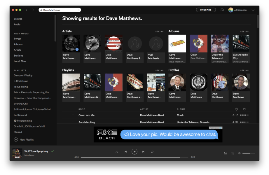
I performed a competitive analysis to familiarize myself with the different nuances of search, specifically those searches that return multiple categories of results.
What I learned from my research
  • Full screen takeovers provided a good view to a large collection of results
  • Live search results help narrow down content quickly and don’t make users enter in a full search string to find what they need
  • Segmented drop down results could provide a breadth of results across multiple categories, but each category is limited to the number of results

Design iterations

Iteration 1 : Full screen takeover

Rough flow to perform a search and change result types
Details about this version
  • Used a full screen takeover to show off a large number of results for a given category
  • Results were segmented by category but can be easily switched to another via the drop-down
  • Default results were still contextual to the page you were on
  • Using a drop-down provides flexibility to add new categories in the future
  • Each result is actionable based on the type of content and its state
  • The results shown were components that were already created elsewhere in the client, which cut down on development time
Issues with it
  • Having to change the search category introduced too much friction
  • Concerned that the user would not be able to figure out how to exit the overlay

Iteration 2 : Segmented drop-down

Addressing issues with the previous iteration
The next version addressed the friction issue caused by separating the different result types. This new version focused on a more traditional drop-down of results as the user typed but showed a few results from each category.
Details about this version
  • Adding segmented categories highlighted the breadth of results
  • Supported diving deeper into a specific category with a "View all" link. The next page would show only those types of results.
  • Removed categories with no results. This would help bubble up things like a game you had not yet purchased or a person, who most likely would not have username that matched a game title.
  • To follow traditional search patterns and provide space for more results, a separate search results page was added for when the user hit Enter/Return.
  • Drop-down kept the user in context of the page they were on

Iteration 3 : A segmented full screen takeover

We could not implement iteration 2 due to engineering bandwidth
While iteration 2 was favorably reviewed by the team, we did not have the engineering bandwidth to do a dropdown and a search results page. To hit our deadline, I removed the drop-down and used a full page takeover that updated as the user typed. This is similar to iteration 1, but it would show results from each category instead of just one.
Details about this version
  • The order of the results are always the same. Games that you own, content that you could buy, and people to connect with.
  • Any category that didn’t have content would not be visible. The thinking behind this is that if someone searched for a game they did not own, store content would appear at the top. If a user searched for a person, most likely all game content would disappear, bringing people to the top.
Concerns
  • Users might find it hard to exit the full screen takeover
  • Users may prefer the lighter feeling of the drop down results

User testing

Why I wanted to test this solution
Before we shipped off iteration 3, I wanted to test it to make sure that a full screen takeover was not going to be an issue. We ran the test against iteration 2 since it used a more common drop-down pattern.
Results showed a preference for iteration 3
Users had a slight preference towards iteration 3 and had no trouble using either of the prototypes to perform searches. Since we did not encounter any issues, saw it was preferred, and knew that it would be easier to develop, we shipped iteration 3.

Final design

Wrap up

Results
  • $6 million uplift in revenue per year through increase usage of search
  • A robust, modular system that could support any new type of content
What I learned from this project
  • Sometimes the simpler solution is better for both your team members and the users
  • Search can be more complicated than it initially seems