Sam’s Club | 2019

My Club

Time
9 months
Platforms
Android, iOS
My role
Lead designer overseeing 3 other designers

What is it?

My Club is a tool for managers at Sam’s Club to track their store’s key metrics to identify and address issues ASAP.
The problem to be solved
Store managers did not have a good way to track their store’s key performance indicators (KPI). There was a lot of performance data, but it was scattered between various tools and was difficult to quickly comprehend.
Key outcome
The My Club app has become a critical tool for all store managers whom use this daily to manage all 600+ stores nationwide.
Goal

Create a tool for store managers at Sam’s Club to better understand and identify issues with their critical KPIs by consolidating and visualizing existing data.
Requirements
  • Design a system that would support 10 different KPIs
  • Compare year-over-year changes for different time periods (Yesterday, Today, Week to date, Month to date, and Year to date)
  • Provide consolidated views of each KPI for three levels of upper management
  • Compare performance across stores, markets, and regions

Researching the space

Learning about the space
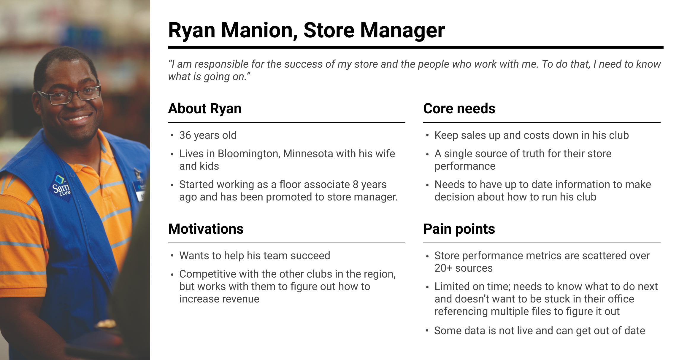
I interviewed store managers to get insight into the business, the challenges they face, the different KPIs that are tracked, and gathered documents they use. We discussed what they look for in the data and what they do to address their issues.
What is important to managers
Managers are passionate about supporting their teams and helping address problems they have so the store succeeds as a whole. To do this, they need timely, clear and concise data to make decisions.
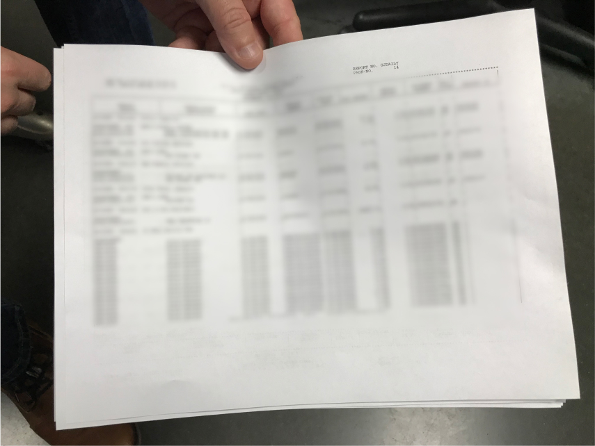
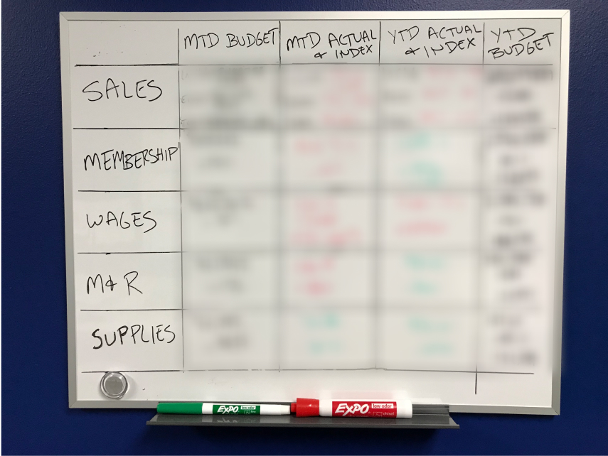
Existing documentation managers were using to track performance
Below are just a few of the reports that the managers at a Sam’s Club store use on a daily basis to track their performance, identify outliers, and compare themselves to other stores in their area.
What managers look for in the data
  • A consolidated view of the data to understand how the store is doing at a glance
  • Where are they below their targets so they can address issues
  • A comparison to nearby stores so they can ask those managers for advice

Addressing these needs

Strategy

My strategy to address the user’s needs
  • Create a dashboard to provide a high level overview so managers know where to focus their efforts
  • Identify common elements between the different KPIs for reuse
  • Create a reusable structure around those common elements
  • Test applying different KPIs to the structure to see if it holds up

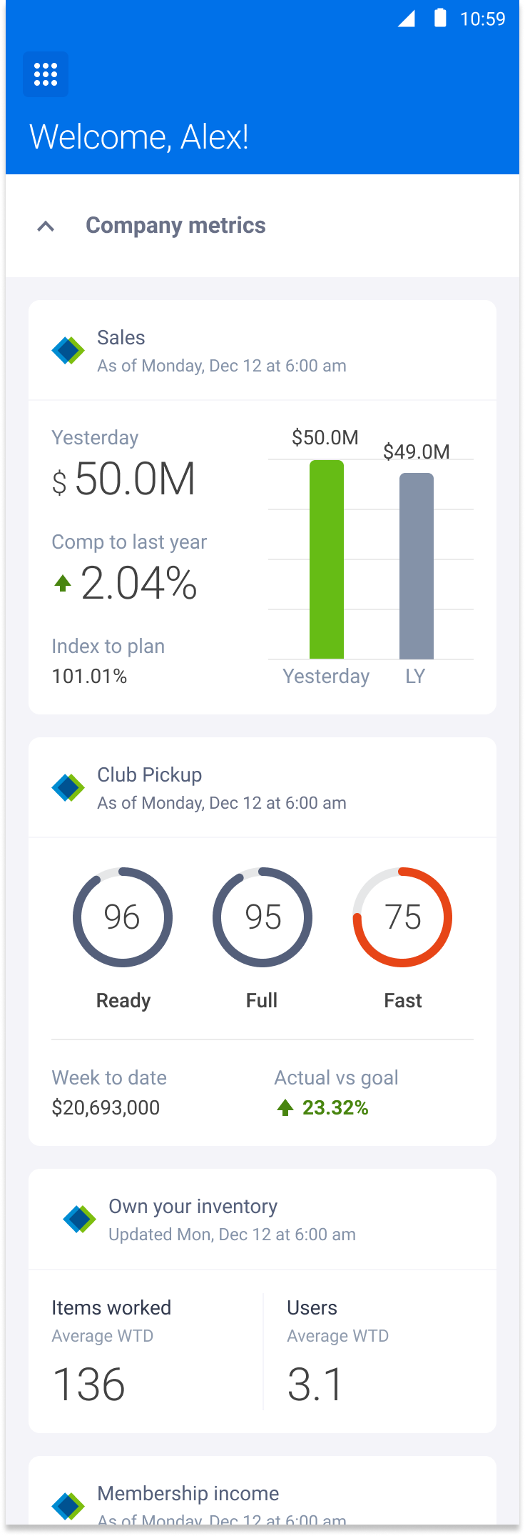
Dashboard

Creating a dashboard that directed manager’s attention to what needs to be worked on next
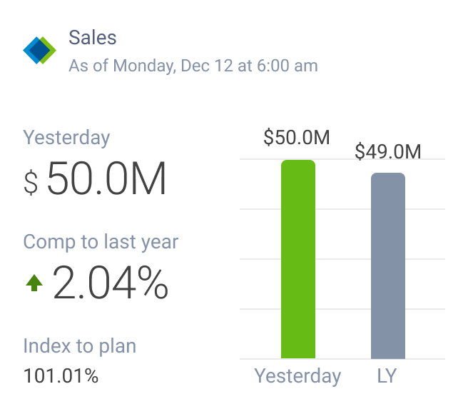
The dashboard needed to be something that would enable managers to get a quick overview of how their club is performing. Because of this need, I limited the information on each card to only critical information. Additional details could be found when the user taps into a KPI.
Dashboard cards
Explored keeping the card short so the user could see more of them on screen at once.
Ultimately decided on increasing the height to add more data to these cards. I traded off maximizing content on screen for a better view into the data.

Common elements

Identified the common elements for our KPIs
After reviewing my research, I identified a handful of things that would be needed for multiple KPIs. They are as followed.
  • Charts to view performance over time
  • Comparing data from last year to this year and the percentage of change
  • Sorted lists showing the top and bottom performers for a given data set
  • Comparing data between peer stores

General KPI structure

Initial explorations
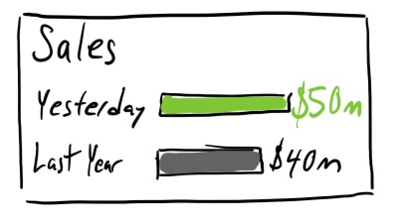
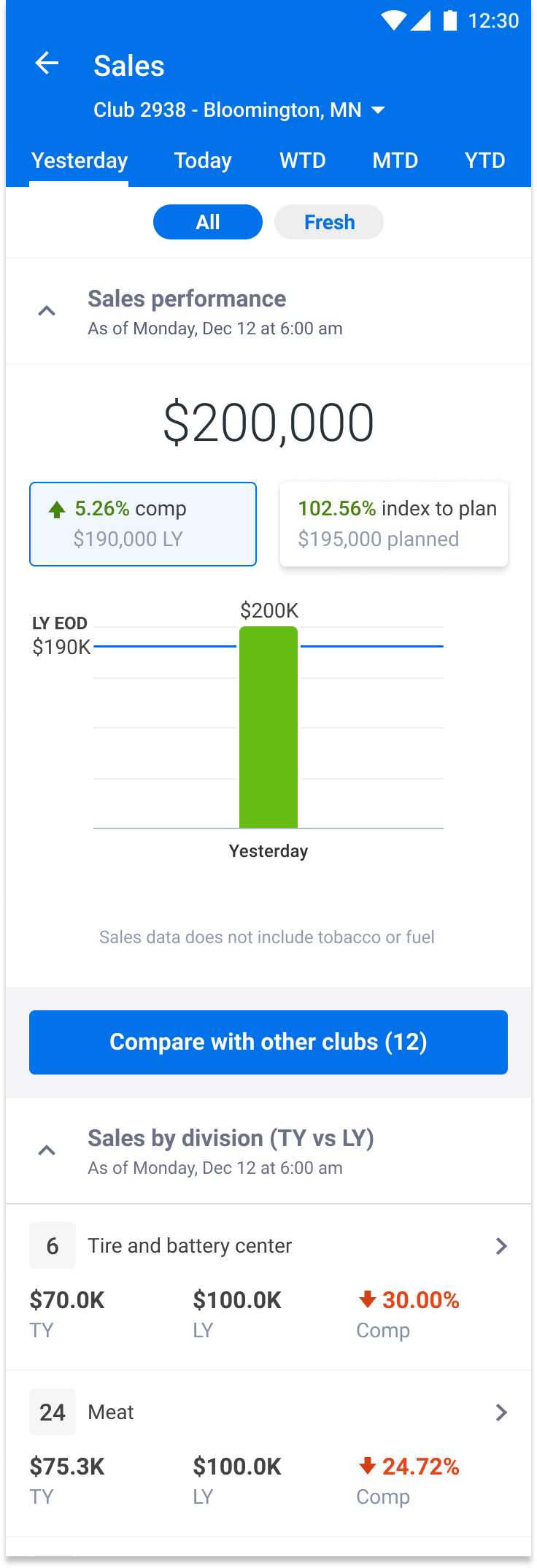
I started by sketching out the most critical KPI that we wanted to capture in this new tool, the Sales KPI. We knew from the beginning that several of the metrics would require us to have an overview with the ability to drill down to uncover more information. I used the Sales KPI as a way to explore a pattern of surfacing critical information at the top level with ways to jump down several levels to get to key pieces of information.
The general structure of each KPI vertical
All KPIs have a similar structure, allowing you to jump to sub-sections easily from higher levels.
Supporting multiple levels of management
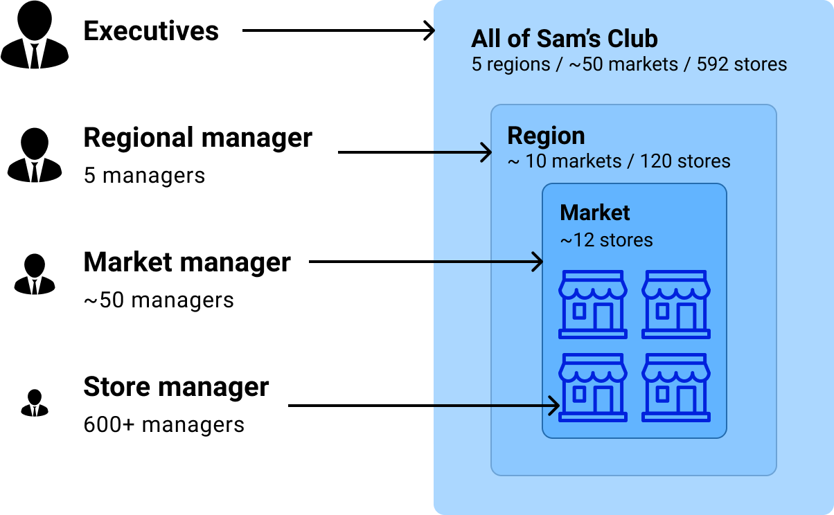
Our business partners wanted consolidated views for multiple levels or managers, ranging from the store managers up to executives. Each level of management oversaw a collection of managers below them in the company.
I used the existing pattern of how the managers drilled down into a specific KPI and extrapolated that backward to allow each management level to see a collection of stores, markets, or regions for each KPI. Any manager could see what their peers see and anything below their level.
What each level of management could see
Sam’s Club has multiple levels of management. Each level needs to have an overview of KPIs, visibility to their peers data, and the ability to view the metrics of all lower levels.

Select final screens

Wrap up

Summary
This is only covering the first KPI that I worked on and the system that I established for the remaining KPIs in this app. I built out many more KPIs than just the one that you see here, but for the sake of brevity, I focused on the first KPI that laid the groundwork for all others.
Results
  • Built out the Sales KPI, shown here, and many other KPIs
  • Eliminated multiple antiquated systems, emails, and other physical documentation
  • Created a mobile app that gives managers live data throughout the day, allowing them to check their metrics while out on the store floor
  • Established a modular framework for continued expansion of the tool
  • Created patterns that are being reused in other internal tools
What I learned from this project
  • Learned how to lead a project and direct multiple designers under me
  • Deepened my understanding of the Sam’s Club business